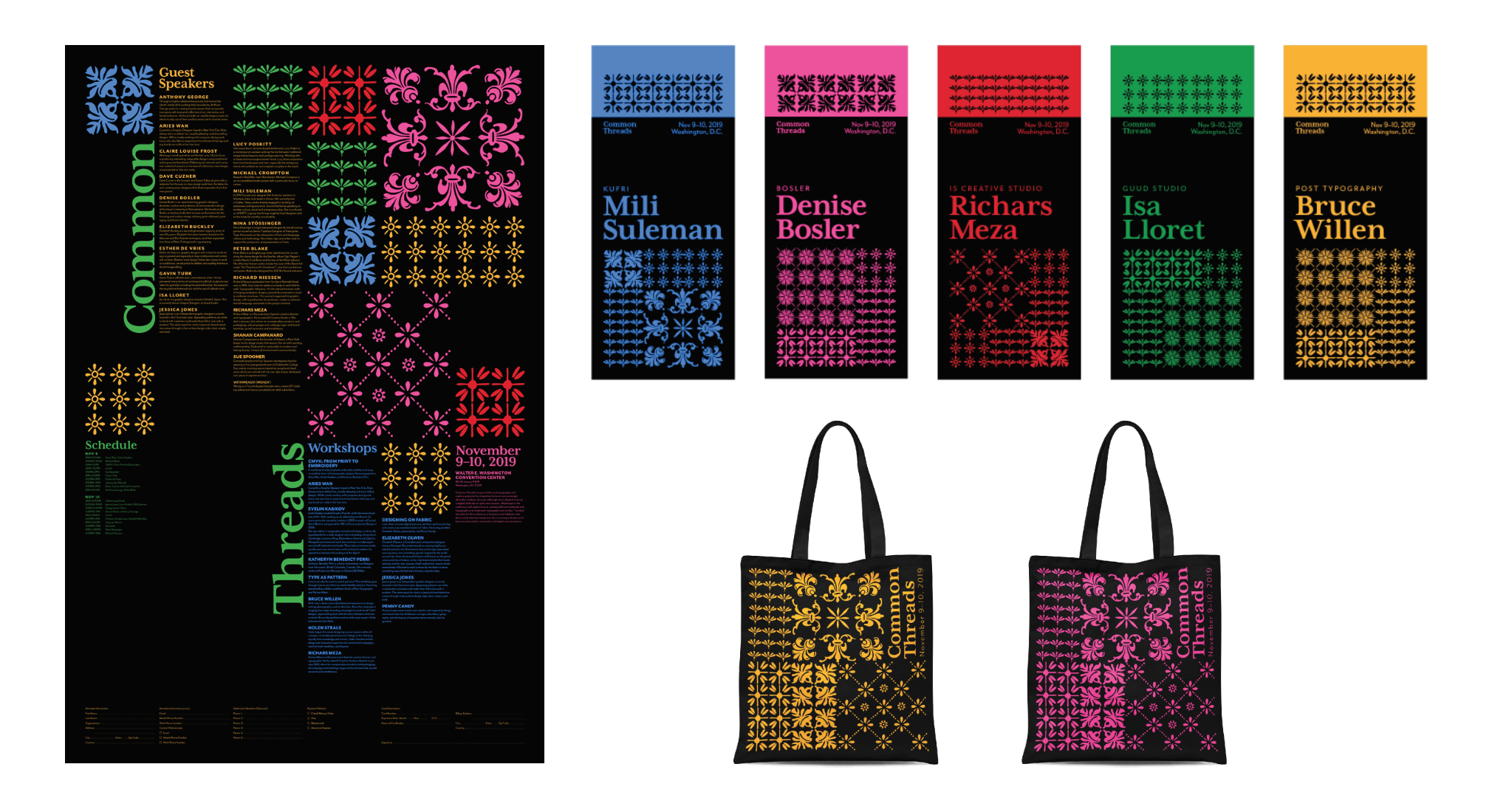
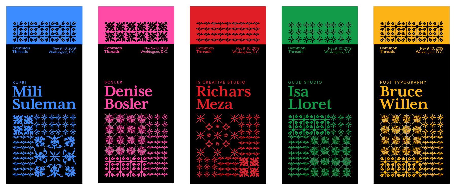
Flexible identity for an imaginary conference called Common Threads.
“Common Threads merges textiles and typography and explores potential for integration between two seemingly dissimilar mediums. Workshops in the conference will explore how to combine different materials and typography or to implement typography into textiles. The ideal attendee for this conference is designers and hobbyists who like to work with their hands and who is looking to break out of barriers and combine materiality and digital communication.”
research & process
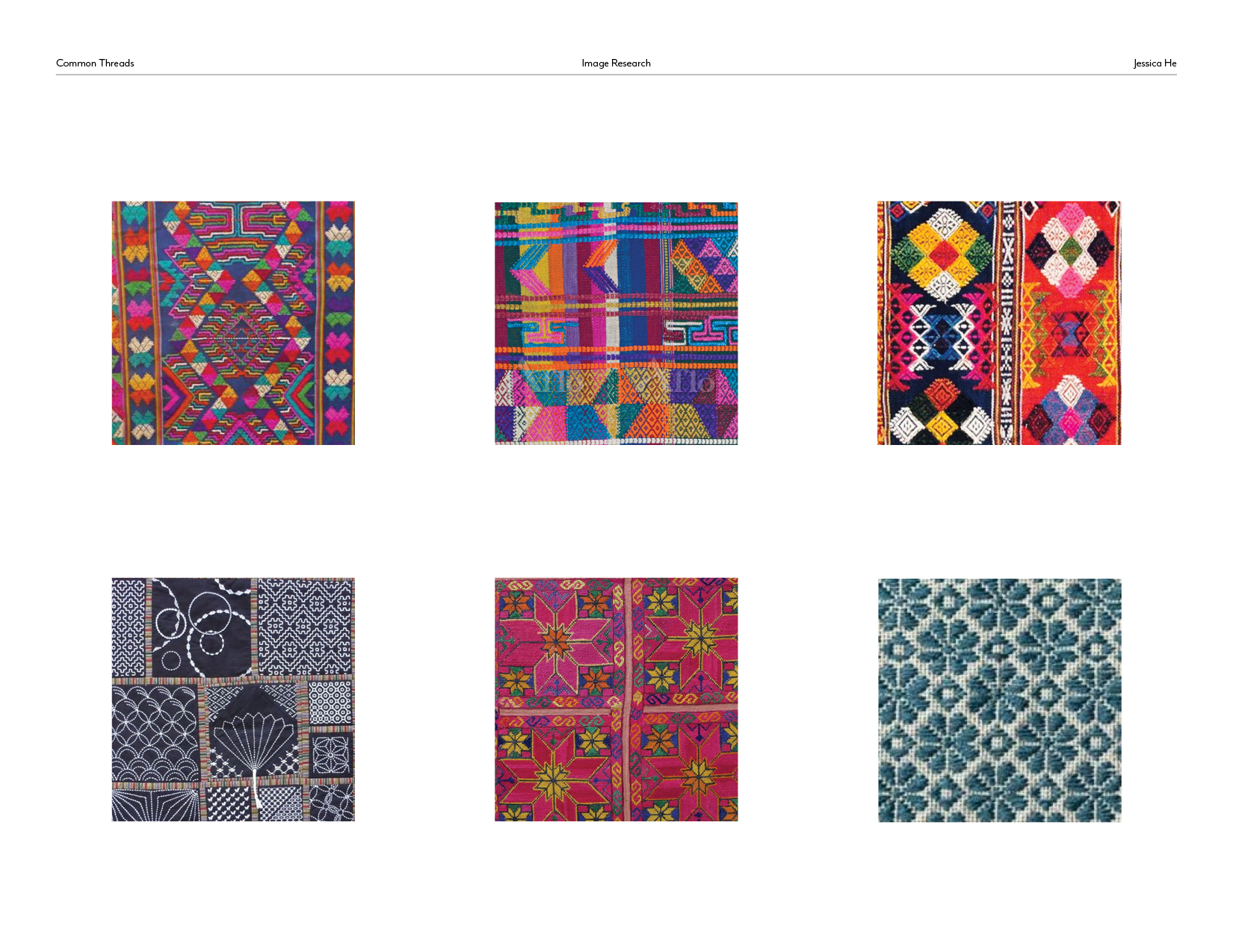
I started the whole process by researching textiles and embroidery and compiled a pool of Asian, Middle Eastern, and South American textiles and Japanese sashiko embroidery as my primary reference points. What I was looking for was textiles that had an established grid structure and geometric and/or tiled patterns, which I felt connected well with typography.
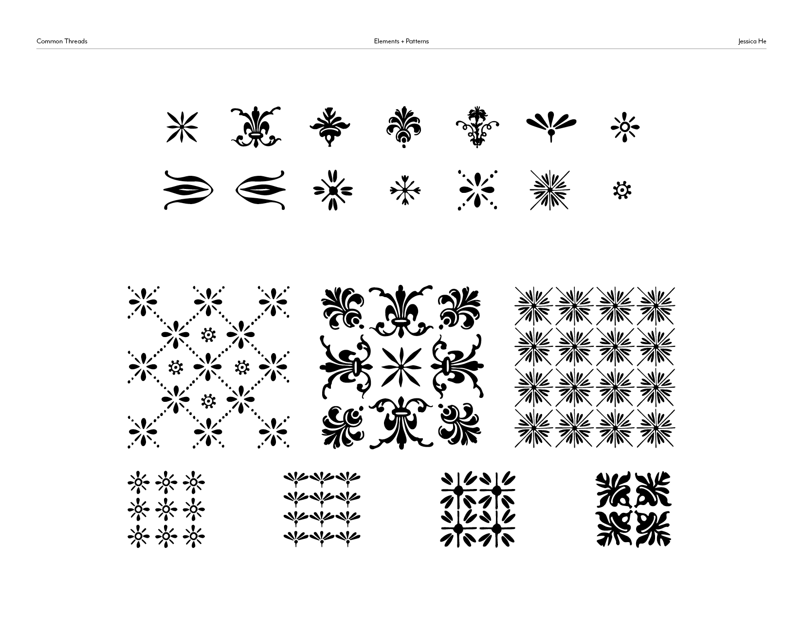
The patterns used throughout the Common Threads identity were constructed out of Bodoni Ornaments. It’s typographic while retaining an illustrative flair often seen in textiles. I made numerous patterns and whittled it down to seven patterns—three large patterns whose size was equal to four smaller patterns.
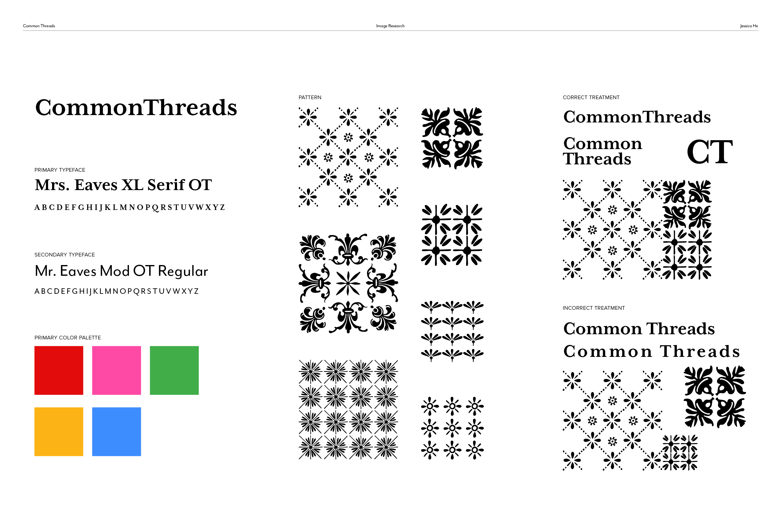
The style guide for the identity.
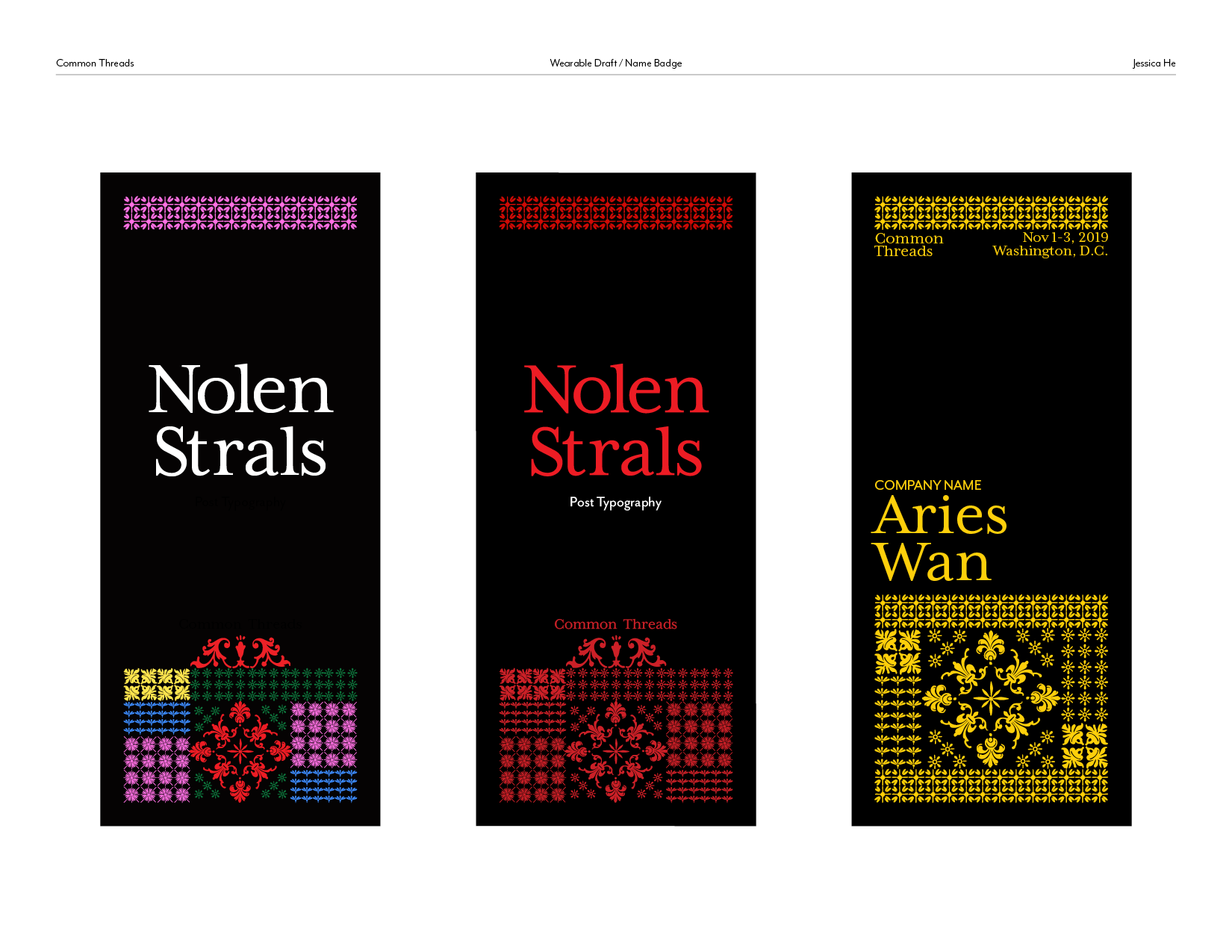
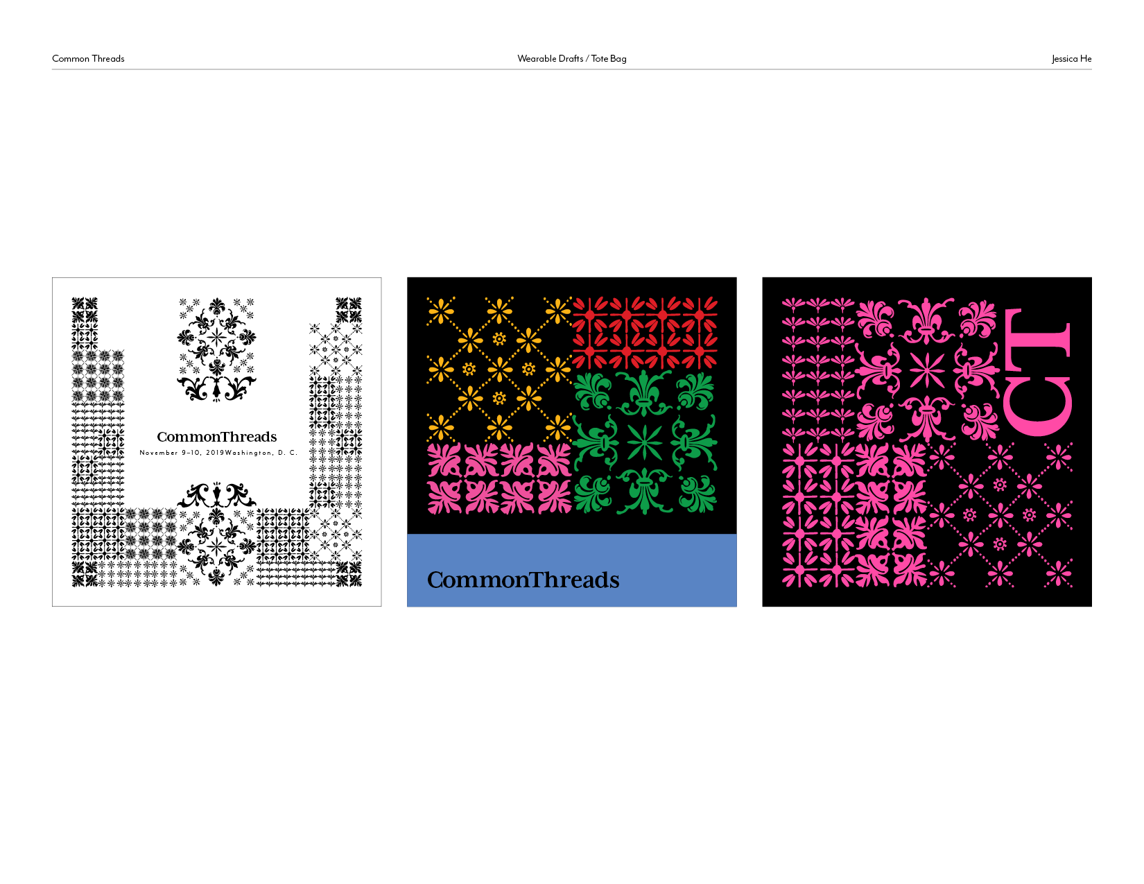
Early iterations of the name badge and wearable. At first, I had incorporated all the colors into the design, but it caused the composition to have no focus so I simplified it to a singular color from the overall palette for each name badge and wearable.
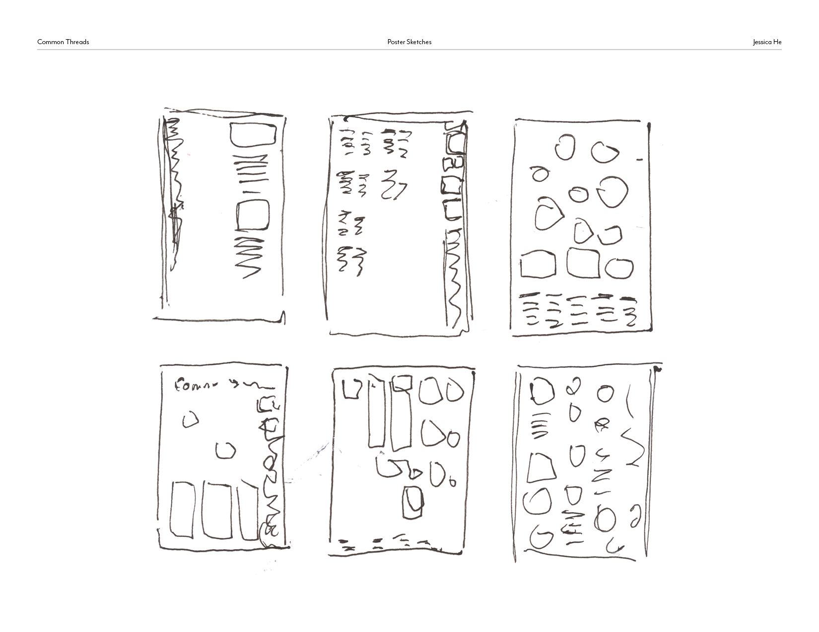
Thumbnails for the poster.
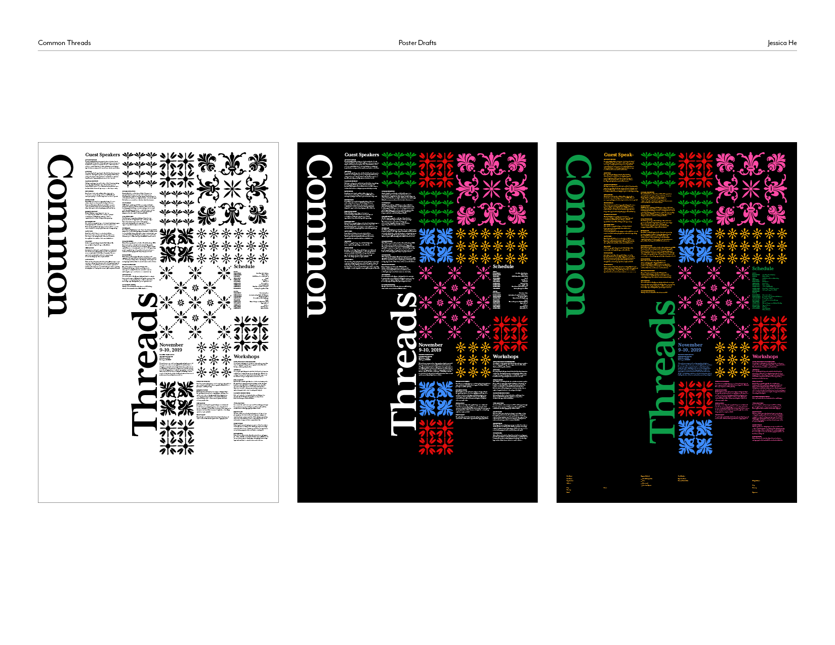
Poster drafts.
01. poster

02. name badge
03. wearable
